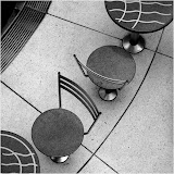
 Level 2 Inverted
Although it is not usually my go, my good friend and colleague talked me into playing with my original Level 2 image to have some fun with it. I have come to the conclusion that architects either spend way too much time on ceiling detail or, when trimming back during projects, developers tend to cut costs in other areas. As the inverted image suggests, if the developers had presented the ceiling on the floor they may well have found themselves with a more interesting, albeit harder to clean, entrance to the arcade. I not sure that I feel completely comfortable with this type of approach to my photography (I would have preferred a stronger composition to begin with) but I think that this image is a more interesting interpretation that the original …


2 comments:
I've got it! Your good friend and colleague now realises why this version of your image appeals to him so. It resembles the entrance to a Gallifreyan shopping arcade no less!! Immediately identifiable by the TARDIS like design principles applied to the walls and floor, including a replica of the famed centre console that moves erratically up and down during shifts in Time And Relative Dimensions In Space. No doubt you noticed that aspect when you rotated!
Thanks for the comment, Martin, but I led a very sheltered childhood and never really got into the good doctor's adventures. I am aware of the TARDIS and some of its capabilities, but not the details of the show. However, on the other hand, the really, really, really cool thing about art (not sure that is what I do) is that other people can attribute all sorts of things to the work, and if that is what the image evokes for you, it can't be all bad. cheers. b
Post a Comment